5 Advanced A/B Tests to Run in Your Lead Funnel
More than 4.5 billion people across the globe and 312 million in the US have access to the internet. Not to mention, they do a lot more than just scrolling through Instagram feed or exchanging snaps while spending their precious time online. As a business owner, how quickly you can conquer the market is determined […]

More than 4.5 billion people across the globe and 312 million in the US have access to the internet. Not to mention, they do a lot more than just scrolling through Instagram feed or exchanging snaps while spending their precious time online.
As a business owner, how quickly you can conquer the market is determined by your ability to identify potential customers out of these millions of users.
Creating a website and posting attractive product images alone can’t help you do it.
You should do something that can place you higher than your competitors in search results. With Google playing around with algorithms every other month, SEO can no longer guarantee you a stable income anymore. The only other option left for you is to build an email list that can drive traffic to your product sales page even when Google decides not to.
Putting that ‘sign up here’ or ‘join our newsletter’ button on the homepage isn’t going to be of much help either as almost everyone does that. If you want to stand out, then start thinking from users’ point of view and work on building funnels that can capture leads and turn them into buyers over time.
In this post, you will learn five advanced A/B test ideas to optimize any funnel page and turn it into a fully-automated lead capturing machine. By running these tests on your landing pages, you can boost conversion rate and grow an email list that gets you hundreds of thousands of product sales almost at will.
Ready? Let’s start!
But first, let’s understand what A/B testing is.
It’s a powerful technique to compare two different ideas and choose a winner between them. A winning idea improves your lead funnel’s conversion rate, email opt-ins, and sales figures. Now that you know how it works, let’s discuss five advanced A/B tests to run in your lead funnel.
Full-Screen Clutter-Less Experience vs. Keeping Existing Navigational Elements
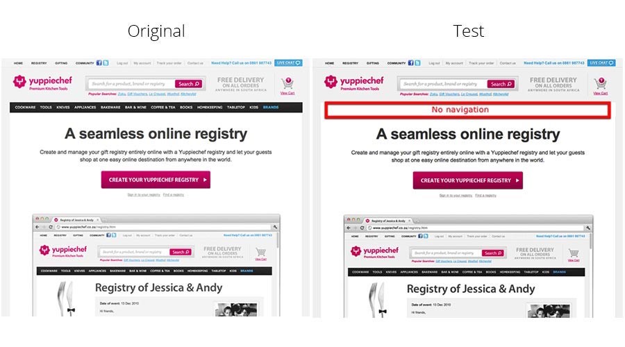
There is no doubt that navigational elements help users browse through your website with ease, and keep the bounce rate down. However, if you want their undivided attention to the lead page’s offer, removing the navigation bar can be an excellent idea.
Bringing in the full-screen experience without any distraction will keep users hooked on to your offer compared to when you have navigational elements that can prompt them to move to another page without sharing their email.
Yuppiechef did something similar and removed the navigation bar from the landing page that they created to promote online registry services. At first, it looked like a bad move and could potentially spoil their campaign. But the results surprised everyone.
The conversion rate on that particular page increased by 100%, something even the team implementing the changes hadn’t expected.
So, the takeaway is if your goal is to capture leads, then try to offer a clutter-free experience to viewers. Get rid of everything else that can distract them.
Although this move can also result in less traffic and a high bounce rate, you’d never know what works for your audience without giving it a try. Run a split test with two variants and test the idea before arriving at any conclusion.
Personalization Through Testimonials Placement
It isn’t easy to test the copy of your testimonials, but you can check how their placement affects the opt-ins. Usually, they are placed at the bottom of the page. However, for A/B testing, you can place testimonials right above the CTA on one page and below it on the other.
According to Cialdini’s 6th Principle that is Consensus, people are more likely to buy those products that others appreciate. While some brands get good results by placing testimonials at the bottom, others like to use it slightly higher on the page. That said, just because something works for others doesn’t mean it will work for you also.
What you can do is create two variations, place one above the CTA, and another below the CTA to see which one gets you a higher conversion rate. Keep testing different variations until you get a winning option.
Nonstandard Rhetorical Questions vs. Standard Questions
It takes your first-time site visitors just three seconds to make up minds about whether they want to stay on your page or exit. It’s called the ‘blink’ or ‘three-second’ test that most leading organizations use to increase the number of leads they capture regularly.
When you ask a good question and make users believe they know the answer, you trigger their natural answering reflex and prompt them to take the desired action.
It can get tricky if you don’t know the right questions to ask. An excellent example of it can be nonstandard rhetorical questions that have no answers. When users see a question on your landing page that they cannot relate with, they immediately exit or switch to another page.
However, when you ask questions that are answerable and somewhat exciting, chances are they’d like to know what happens next when they answer it. This is where your CTA comes into the picture. You can easily get through users’ defense mechanisms with well-crafted questions and make them answer it. As they do, capturing their email becomes easy and smooth.
For this A/B test, you can split your traffic into two parts. Send one set of users to a landing page with nonstandard rhetorical questions that may sound interesting but are unanswerable. Send another group of users to a page having standard questions that are impossible to ignore.
Attach your CTA carefully with both the variants and run the test for some time.
Once the results are out, you’ll know that standard questions get you a higher conversion rate than nonstandard rhetorical questions.
The key takeaway from this split test is asking simple first-person questions that your target audience can answer. Depending on your niche, you can try different variants to see which one gets you the highest conversion rate.
Minimize Inputs With Buttons Vs. Having Fields
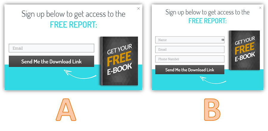
As much as you may want to know your lead’s detailed profile so you can pitch them the right product, it’s not recommended to make them enter all the information in one shot. Even if you have been getting tangible results with this strategy for a long time, consider changing it for better results.
In simple words, ask for only that information, which you must know initially, i.e., their email id (and name alongside).
Typically, after seven fields, the conversion rate of a landing page starts to drop off significantly. So, forcing your leads to enter their address, phone number, age, gender, location, and postal code is the worst way to deal with users as soon as they land on your page.
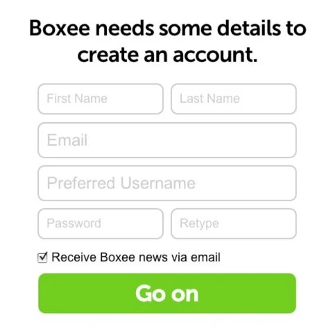
The best-case scenario is having a maximum of two fields to minimize the input.
Another vital point you should know is leaving enough white space on the landing page increases conversion rate. Take the example of Google.
Even after having billions of monthly visitors, Google has a minimalistic landing page to provide a clutter-free search experience to users.
You can also do the same and get rid of unnecessary elements from the landing page, especially around the opt-in email form, to ensure users don’t get distracted.
Besides, use radio buttons on the landing page to help users enter information without any hassle.
For the A/B test, you can design one landing page with multiple field elements and less white space, and another page with enough white space, two fields (for name and email), and no unnecessary elements. The first option is likely to come out as a winner in this case. Still, you can try multiple variations and see how it works out in your niche.
Multipage vs. One Page
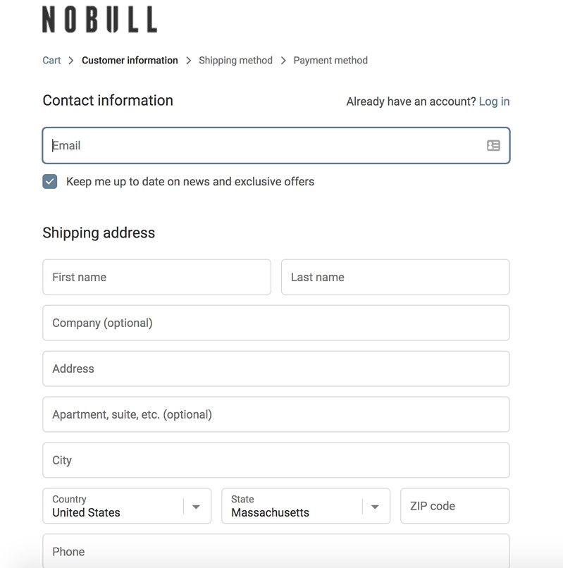
Most e-commerce stores have a multipage lead capture setup wherein users are asked to enter some details on one page, press next and enter the rest of the details on the next page. The check-out page comes at the last where they are requested to enter credit card details before placing the order.
All the information users enter on multiple pages could have been entered on a single page also. But all the e-commerce sites know how messy it can look when a lot has to be entered on a single page.
This is about e-commerce stores where users go intending to buy something. But for a lead capture site like yours where people go without any intention, placing multipage lead funnel can be tricky. That said, if it’s necessary to collect a lot of information, then consider breaking it down into various pages to offer a smooth experience to users.
One page lead forms are useful when you need limited information like name and email from users. It’s tough to choose a winner between them unless you run an A/B split test to analyze the results yourself. So, create two variants — single page lead funnel and multipage lead funnel. Drive traffic to both through paid media and see which one converts better.
In short, what works for someone else exploring the same niche as yours may not necessarily work for you. That’s the beauty of capturing leads through landing pages. You must always be ready to run A/B split tests to identify a winning option.
The suggestions mentioned above have brought fruitful results to many site owners in the past. You can also try them on your lead funnel and boost its conversion rate by a significant margin.
More from our blog
All you need to know about Multivariate Testing