Google Adwords Data Visualisation Templates Essential For Paid Search
In order to visualize thorough and specific Adwords data, you need to have a good understanding of your business. There is no better tool for that to use than Google Data Studio itself. It’s free, powerful, and can give you valuable insights on everything you need to know in terms of the digital marketing of […]

In order to visualize thorough and specific Adwords data, you need to have a good understanding of your business. There is no better tool for that to use than Google Data Studio itself. It’s free, powerful, and can give you valuable insights on everything you need to know in terms of the digital marketing of your organization.
It first came up in 2016 and ever since has been the leading software in digital marketing. Features, updates and improvements are implemented on a monthly basis. However, regardless of how easy it is to operate with Google’s valuable tool, you still need to carry out the responsibility of deciding which visualizations to go for. These greatly rely on the type of business you are running and the type of audiences you are targeting.
It is much easier to decide when you have clear templates presented, so feel free to look into our examples below in the article.
Exemplary Visualizations for Google Ads
#1 Reference lines charts
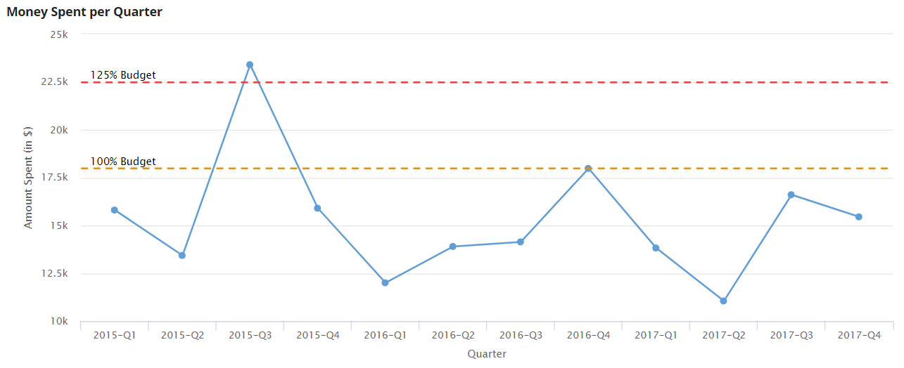
By using reference lines you can easily determine which quarter is above budget and which quarter or period is below budget. Moreover, you can easily set up various lines on the same graph. Separate graphs might need different reference lines but they easily allow you to compare without having to write things down and check each data point individually.
Not only would this save you a ton of comparisons but it will also allow you to work faster and decide at a glance whether something needs to change in your budgeting strategy.
In the case above, our chart uses 2 reference lines, one of 100 per cent budget and one of 125 per cent budget. You can easily add a third reference line if you don’t get confused to complete the picture.
You can use a similar line to place averages or targets and see whether your results outperform them.
Simple steps to create a reference line and add it to a chart
- Create a simple chart
- Navigate to the “Style” panel
- There is a button that allows you to choose the type of reference line. (Such can be metric, parameter, or a constant).
- Select what you need and what fits your needs.
#2 How to use KPI Scorecards
KPI Scorecards can be used to dish out clear digital marketing campaign results and to simplify your dashboards. You should only stuff in the most important metrics that you check on a daily or weekly basis. There are some machine learning algorithms that can do that for you, based on what you check. But you can also manually set it up.
*KPI = key performance indicator
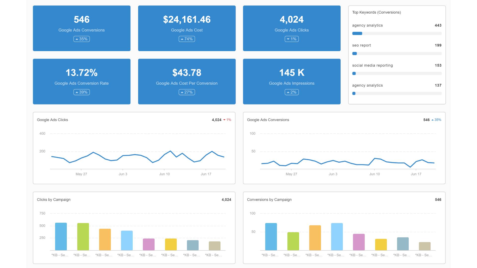
It is a very good idea to arrange the KPI scorecards on the dashboard by priority of each indicator. For example. if what matters most for you is the conversion rate, place it at the upper left corner. If CPC is what matters for you, place it there.
Moreover, you can easily adjust the colours and comparison metric details of each indicator from the Style panel.
How to properly set up KPI dashboard scorecards?
- Select a data range dimension that fits your needs. The most often used one is per month.
- Select a KPI per scorecard. (One metric for each scorecard).
- Select something to compare it to. (A previous period, for example, last month.)
#3 Zoom out charts (Time Series)
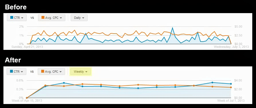
Granular data has its perks, but sometimes we need to look at the big picture, especially if we are aiming to spot trends and tendencies, as well as anomalies.
You should never overlook spikes or drops that are unusual, and in order to spot them in the first place, you need to extend the period a bit. From daily to weekly, monthly, quarterly or even yearly in some cases. Sometimes, in the short run, you might experience a decrease in volume and if you don’t zoom out the chart in order to see that actually, it has been steadily growing for the past few months, you might make the wrong decision and change something.
In order to set up proper dimensions for the time series, you should use:
- 1 = Day
- 2 = Week
- 3 = Month
Any metric can be used, according to your personal preference.
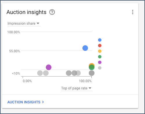
#4 An Auction Insights chart (Scatter Plot)
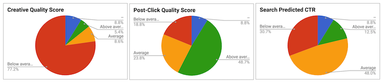
Auction Insights can be a tricky thing to master. Since at the start your company would be shown as a null value, it might be a bit counterintuitive to grasp at first. Outranking share, impression share and average position can all work together in order to show you a relation that you won’t find anywhere else.
How to properly set up an Auction Insights Chart?
- X Metric: Average Auction Position
- Y Metric: Outranking Sh. Position
- The bubble size: Impression Sh.
Sort all of this by the average position for the auction in ascending order. Don’t be scared when you see a reverse axis on the X and Y dimensions, this is usually how a traditional auction insights chart looks like. The minimum value for the X is 1. It should look something like this:
#5 Google Trends Chart
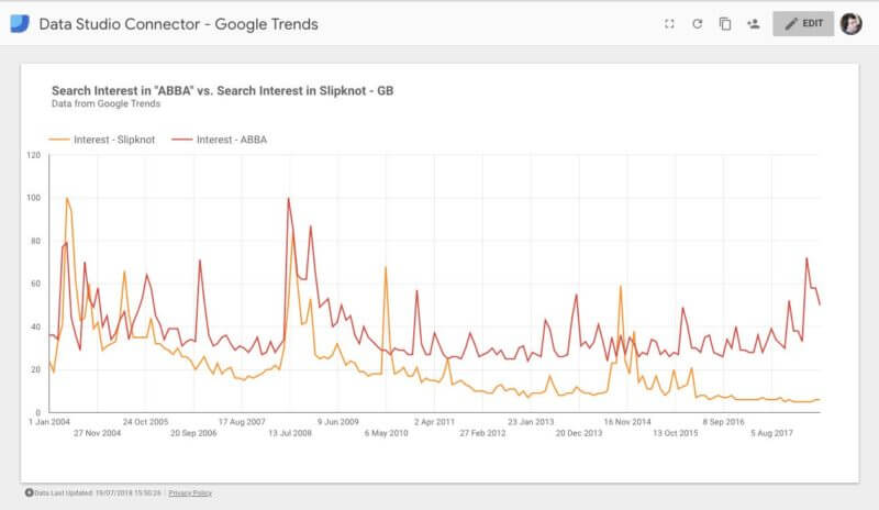
By using Google Data Studio you can compare trends in search on various keywords for a certain time period. You can easily determine whether some brand is preferred over others, whether a specific product category is more trendy over another in the span of a season or a few months, etc.
Seasonality, cycles, and recurring events can all be seen here. Moreover, one-time catalyst events can also turn the tide. A major concert will certainly spike the interest in one rock band over another, especially if it was a great success.
The creation of a Google Trends Chart is fairly simple:
- Start by connecting your data sources.
- Select a Dimension. (Most often year, but you can do month too.)
- Metrics: Select anything you wish to compare. For the example given, we’ve shown two separate rock bands.
#6 Video Network Ads Performance (YouTube Ads)
Knowing how your favourite YouTube Ad is performing should be easy. Luckily, cool and intuitive metric visualizations are possible. In order to get one going as soon as possible follow these steps:
- Embed your YouTube Video.
- There are some YouTube specific metrics that can be used for this view, such as the watch rate metric.
- For a metric use video view rate, YouTube earned views, Video Views or even view-thru conversions.
#7 Ad Placements ranking
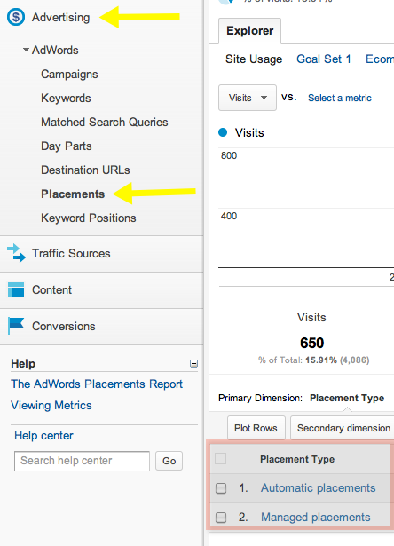
If you are running an agency or consulting a private client, these would most likely be their favourite views. In order to create a good chart here, you would need to import the data needed. It would show your client where the ad appeared in the network, whether someone clicked, how many clicks the ad acquired overall or over a time period.
In order to properly set things up:
- Go to google ads and export the data regarding your ad placements to Google Sheets. Afterwards, go to report settings and select Google Sheets to be the data source.
- Select Placement as a dimension, as well as Placement URL.
- In terms of Metrics, choose conversion value and conversion cost. (But you can choose whatever you wish.)
Afterwards, sort the table by decreasing the conversion value and voila.
#8 Year to Year comparison (12 months to 12 months comparison)
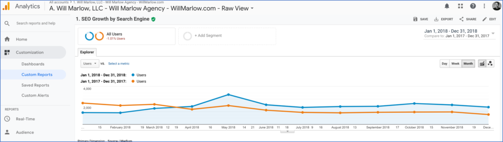
Having a good idea of how your ads perform on a monthly basis, compared to last year’s results not only gives you a general sense of flow and seasonality but would also allow you to actually determine whether there has been any progress. There are some essential key metrics to look out for here like:
- ROAS
- Spend
- Impression share
- Year over previous year revenue
With this type of chart, like shown in the example, you can track other events like registered users, conversions, or even one-time visits, depending on your preference and goals. In order to create a functioning year over year comparison chart, you should:
- Set the date range dimension to date.
- Select a month as the primary dimension.
- You can use any metric you wish to compare.
- Select a default range – Advanced, (Subscract one month from today.)
- And select from the compare to dropdown the same month from last year. For example, if you’re doing this in July, you should select June for both ones.
Conclusion
There are many charts you can set up to properly track everything you need in your Adwords account. Proper data visualization can aid you in choosing the better decision while having to shift your campaign’s focus.
Different views can be used in order to properly tell a story to your clients, or present information in an intuitive, easy to understand manner. Sometimes numbers don’t speak as clearly as charts and diagrams do. Use them to your advantage to better interpret data.
More from our blog
All you need to know about Multivariate Testing