The A-Z Guide on How to Generate Leads on Your Landing Page
When you first think of a landing page, there are two types that come to mind right away – a lead generation landing page and a click-through landing page. If you want to optimise your lead generation process, you should know the difference and how to utilise each one of them. In this article, we […]
When you first think of a landing page, there are two types that come to mind right away – a lead generation landing page and a click-through landing page. If you want to optimise your lead generation process, you should know the difference and how to utilise each one of them. In this article, we will cover the elements of a lead-generation landing page.
Lead Generation Landing Page Distinction
In order for a landing page to effectively generate leads, you would need to carefully extract information from your visitors, without intruding on their private space too much. Moreover, you would need to make the whole process feel intuitive and natural without any forced questions and answers.
Lead generation landing pages serve the purpose not only to extract information from your visitors and potential clients but also to warm them up in the sense of preparing them to commit to your product or services.
The more contact points you have with one client, the easier it would be to reach them anywhere. Thus, an email and a phone number is a good start.
The personal data you most products or services aim to collect at this stage are:
- The lead’s name. (Most often first and last name)
- A telephone number. (Not always necessary and sometimes scares leads off). A small text under the telephone number box might help you by stating it would only be used for certain purposes and not to flood their inbox with sales calls.
- An email address.
What plays a vital role in creating a lead generation landing page?
There are more than just a few tips here that you can implement in order to optimise your website and landing for lead generation. Let’s start with simpler things and build up toward more complex solutions. All of these are effective and can be used at the same time.
1. Focus on CTAs (Calls to Action)
If you don’t know what a CTA is and how to optimise it, you can read our detailed article on the topic – here. A CTA typically serves the purpose of enticing your visitors to take on a certain action. The call to action should be properly worded and placed with caution. Their goal can be to motivate the visitor to:
- Purchase your product
- Subscribe to your services
- Subscribe to a newsletter
- Fill in a form
- Register (Sign up)
- Opt-in for a free trial.
- Make a reservation
Of course, here the options are limitless. CTAs greatly vary with different products and services. But they all have one thing in common. They need to skewer the chances of a visitor performing the desired action in your favour.
For that reason, CTAs are always accompanied by explanatory text, headings, subheadings, mission, and images.
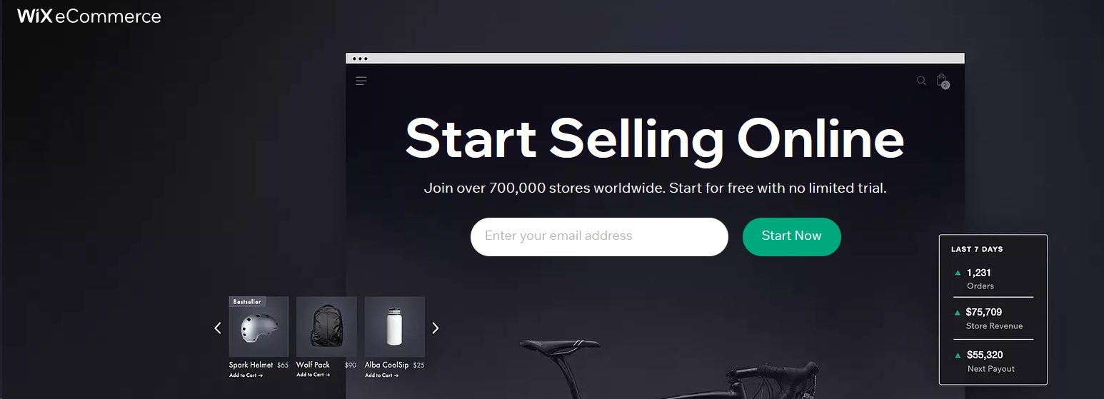
In the image above, you can see how Wix.com battles the initial objection of the visitor, which with such a service would most often be – “I don’t want to sign up for a free trial and then have to pay for my website.”, hence they used the explanatory text “Start for free, no trial”.
Moreover, in the image, you can see how visual elements show that your free website will have access to analytics and stock amounts, as well as a cart, search and other options. All of this is self-explanatory and intuitive. All they ask of you is your email address.
If you are offering different things to different target groups, make sure to clearly differentiate your offers and explain which is for whom.
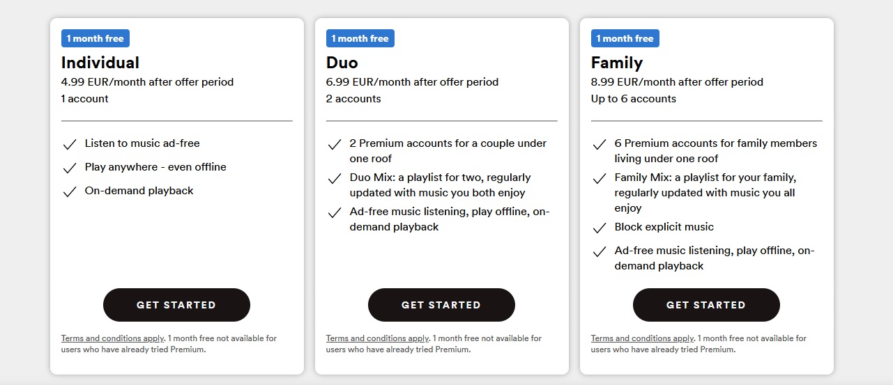
The first option is for an individual, the experts at Spotify, even named it “Individual”, it couldn’t get any clearer. The second offers a substantial discount for a couple, and the third allows the whole family to enjoy the same benefits at a very large discount. Moreover, it offers more features.
2. Your design should hand in hand with your Call to Action
Design is colours, structure, text, placement, user experience and flow, titles, shapes and symmetry, and many more. All the elements should work together toward a common goal.
The text between shapes and images should be floating and with enough room to breathe. Sometimes less is more, and overflooding your potential leads with information might make them bounce off from your website.
In order to optimise your web design for conversions, make sure to:
- Use harmonic theme colours. (Contrast can also be used for emphasis on certain parts.)
- Don’t use round shapes and rigid ones at the same time. Stick to one style.
- Use symmetry to your advantage.
- Differentiate your subheadings and headings from the explanatory text.
- Use simple messages and use language that anyone would understand.
If you are offering a free trial, highlight it. If you are better at something than your competitors, make sure the clients know it right away. Consider using humour or clever techniques and presentations to stick to the customer’s mind even after they leave your website.
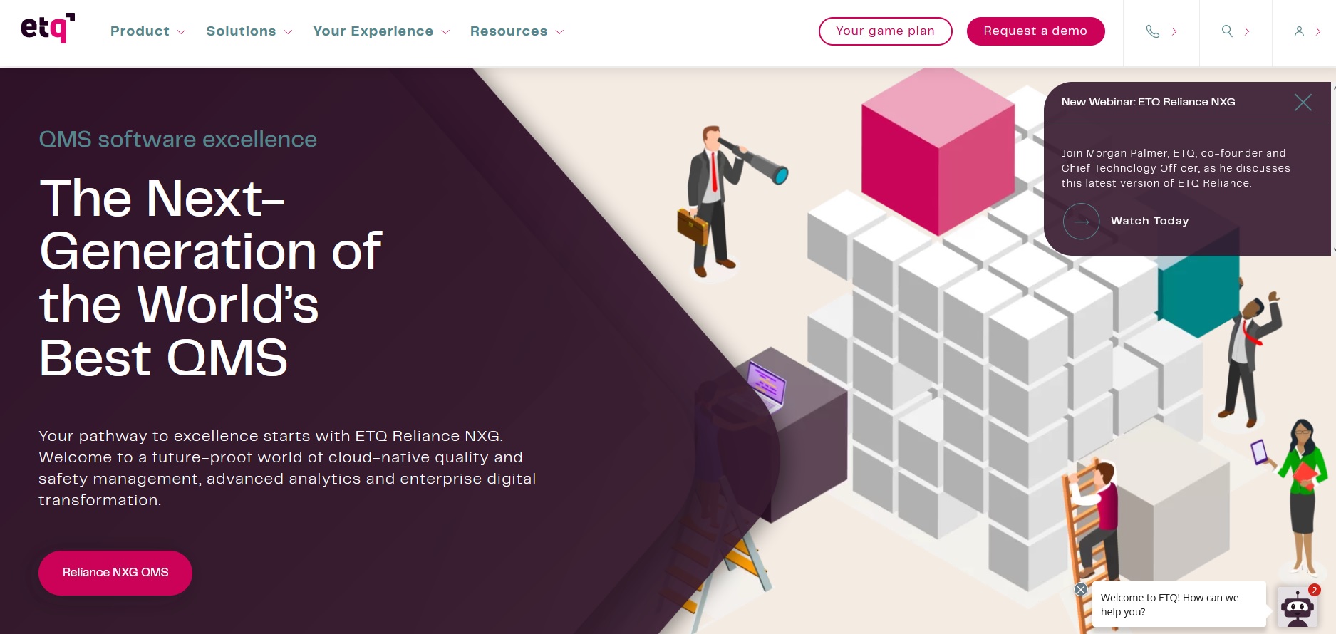
If you offer more than one call to action in the main navigation, make sure to let the visitors know which one is the main one. (Like in the example above, the main CTA is “Request a Demo” and it is filled and more visible compared to the other button right next to it.)
3. Don’t overuse forms but don’t rule them out just yet
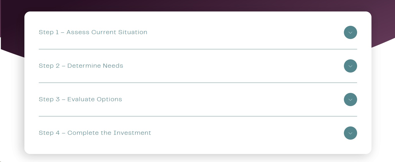
Following with another example of ETQ’s amazing design, their fill forms are not exactly filled forms. They’ve broken down the sign-up process into a hybrid of tailored personalization and fill forms.
What this means is that they make the client feel special, while also gathering information at the same time. Unfortunately, you can’t do this for all your clients in just any type of business, but you can certainly learn from it.
If you are an e-commerce shop, what you can do is request a zip code and an email for the client to receive access to local discounted offers, for example. There’s practically no limit to your creativity here, just remember one thing.
Never ask for too much information or information that you don’t need. If there is some piece of information that you need but the customer wouldn’t be able to figure out why right away, make sure to explain it next to the fill-form.
How to make a form intuitive
- In order to make the best possible fill form, make sure to use checkboxes, buttons, and to utilize instant feedback.
- Use the forms to give out extra information to your customers. Give them ideas.
- Optimise the forms for mobile devices. (Although this one feels like a no-brainer, you would be surprised how few businesses actually do this.)
- Use social proof in sight, next to the forms.
- A/B test everything.
4. Create urgency via limited offers and timers

You can create urgency by using a timer, a date, or even stating that there’s a limited quantity of products remaining. Special dates like Black Friday can be used to further inspire people to act as soon as possible. But such are not necessary for success.
Well-known strategies to create urgency include:
- Limited-time offers (This one can use a timer or a date.)
- Offers that last until supplies run out. (Typically, such offers include an amount remaining box that updates after each purchase.)
- One-time offers. (If you know what FOMO or fear of missing out is, you can easily use it to your advantage with this smart offer.)
Regardless of which offer you choose to go for, make sure the terms are clear and easy to understand. Combine that with a positive call to action, that emphasizes the positive side of the visitor’s decision, like:
- Get a huge 70 % discount today only
- Sign up and Save now
- Buy 2, get the 3rd one free
5. Highlight the benefits of your product
By highlighting the benefits, you shouldn’t understand “the advantages” of your product. Instead, what are the benefits for your customers? Highlight them.
For example, if you are selling the quickest software in some sector, a benefit would be “Save twice as much time per day with the lightning-quick XYZ software solution.” This way of wording directly translates into the visitor’s brain and allows them to process information quicker.
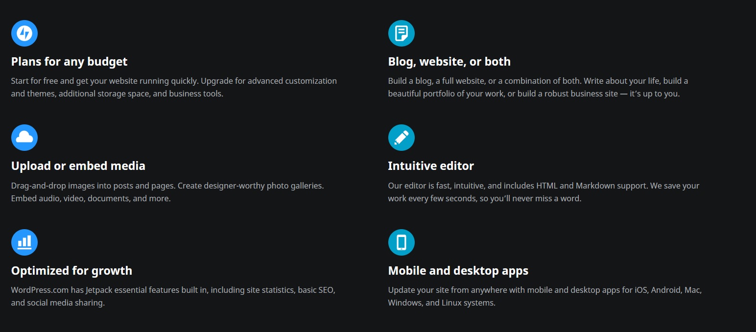
You can also use bullets, green checks or icons, as WordPress does. This way you would further differentiate the benefits of your product or service. You can also present these benefits as imperative form verbs like:
- “Sell easily”, “Sell quickly”.
- Receive updates, analysis and charts.
- Create limited offers.
- Build a blog.
- Start your shop for free.
- Save time.
6. Utilise Social proof and testimonials to your advantage
Testimonials from real customers can make all the difference in the world. Choosing them wisely and pinpointing certain qualities of your product with them can be crucial. Once you have more testimonials to choose from, that gets easy.

When talking about testimonials, simple plain text isn’t enough. Regardless of how praising the lines of text, written on your website are, people are not stupid and know they can be fabricated.
For that same reason, you should use real people and real testimonials. The more authoritative and famous the person is, the better. Regardless, it would be even more effective if you have a link to their social media, or at least a photo, to pair their words with.
Your testimonial givers should resonate with the persona you are targeting.
If you have already reached an understanding regarding the type of persona your product is for, then you should put testimonials of a similar person on your website. If my idol is Vin Diesel, and I see he’s bought a certain product, I’m more likely to purchase that product. As simple as that.
If you don’t know how and where to start, simply ask some of your loyal customers for a testimonial. They would be more than happy to oblige. Sometimes, adding personal details to the testimonial is helpful. For example, if your product is accounting software and one of your testimonials is from a pet store, other pet store owners would be more likely to sign up, since they would know that it works for their competitors.
Other forms of testimonials can also be used, such as:
- Tweets on social media, Instagram posts, stories.
- Screenshots of happy customers, photos, or videos.
- Videos on youtube.
- Use your Facebook page for promotional posts and client feedback.
You can even take things one step further and create a designated testimonials page linked to your social media mentions. Getting genuine testimonials from influencers is also another step toward success since most of them have a great match with their audience.
Success stories can also be something to look for. If someone has achieved something with the help of your product or service, make sure to make it public.
7. Optimise your Conversion Funnels
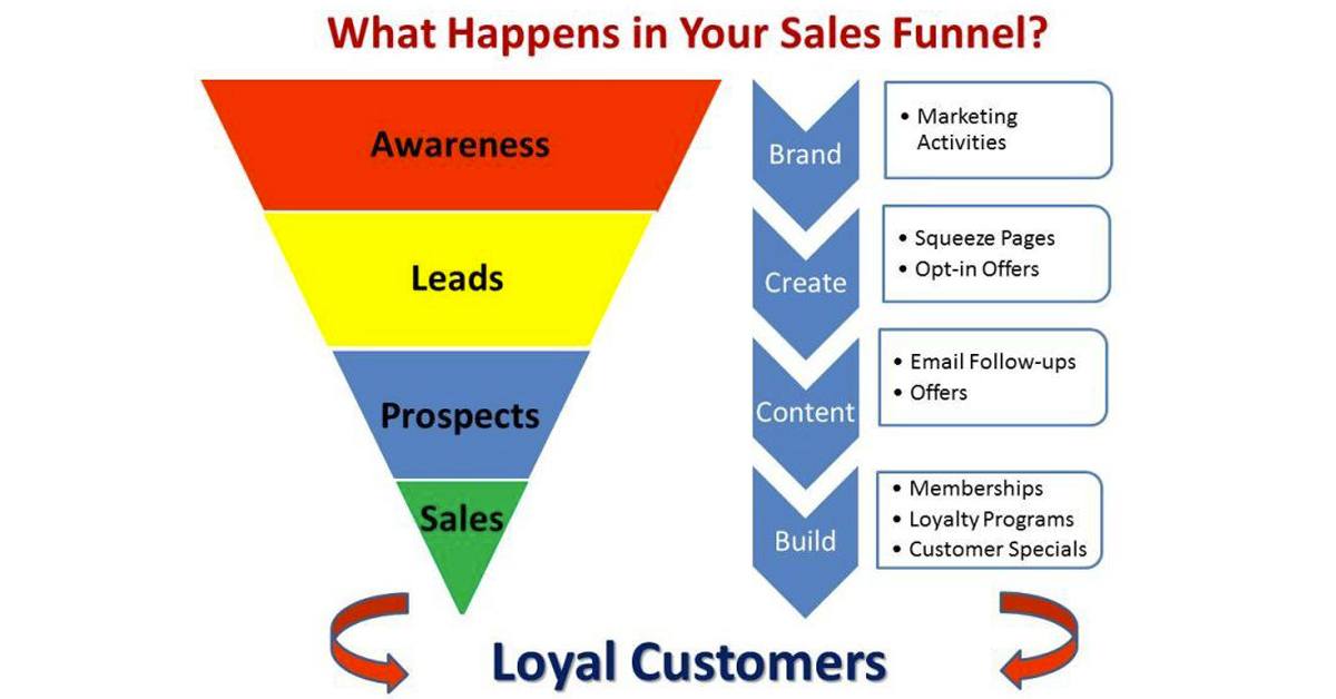
There is a wide variety of ways to improve your conversion rate. If you don’t know what a conversion funnel is and how it works, read our blog post here.
A conversion funnel takes your visitor through a series of steps, eventually leading to a conversion event, which in most cases is either a registration or a purchase. The whole process should be intuitive and properly placed throughout your website, without breaking the user’s attention and losing their interest.
Simple conversion funnels examples:
- You wrote a free .pdf course regarding a certain subject closely related to your product or services. For example, if your product is woodworking machinery, you could write a free course on how to build a table and place and promote your products in the free .pdf, which would eventually lead to your website by links. Once the visitor reaches your landing page, they are thrown into the remaining parts of the conversion funnel.
- Social media ads like Facebook ads can be used to target people with specific interests and tastes. You can build various landing pages for different types of potential customers according to which ad they come from. (In the case of selling machinery – One ad for carpenters, one ad for manufacturers, builders etc.)
- You can use CPC or CPM Google Ads to funnel traffic into your website. Make sure both the landing and the ads are optimised for the same exact keyword.
The important takeaway here is to closely monitor where your traffic comes from and how it responds to the landing you offer. Conduct A/B Tests by switching landings according to the audience and source. Also, ensure to convey the same brand message across all channels.
Conclusion
The secret to having a prosperous online business lies in understanding the behaviour of your customer segments. Clearly differentiate separate user segments and target them with tailored landings. If you don’t have the resources to do that, at least make them feel they are going through a tailored process.
Use design, copy, tone, and proper placement of CTAs to further increase the chance of conversions. Pay attention to the cursor movement patterns of your visitors. Are they focusing on the parts of your website you would want them to? If not, A/B test and see what can improve.
More from our blog
All you need to know about Multivariate Testing