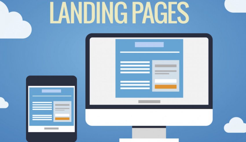
The Comprehensive Guide to Landing Page Optimization
In order to optimize any landing page, first, you must understand your target audience at a higher level. A landing page should usually have one goal – a certain form of conversion, that directly benefits you and your business. Aside from that, your audience should find exactly what they expect when they visit your page. […]
In order to optimize any landing page, first, you must understand your target audience at a higher level. A landing page should usually have one goal – a certain form of conversion, that directly benefits you and your business. Aside from that, your audience should find exactly what they expect when they visit your page.
Someone following an advertisement to register, and being lead to a page where they ought to purchase something often results not only in breach of certain terms and conditions of the platform you use to advertise on but also in a very high bounce rate.
Know your audience
You can get to the bottom of your audience by conducting a few types of research. Such can be one-sided or two-sided. You can simply study your audience by looking at data, or you can interact with people and ask questions. Similar activities that might help you get a better idea of your audience are:
- Surveys
- Focus groups
- Data gathering and analysis
- Building personas
Moreover, when you initiate a meeting with a client, online or not, you should always have questions prepared beforehand. The ultimate goal of your meeting would not only be to gather information but to hear out your audience and decide what needs to be changed on your website and why.
There are some things analytics cannot tell you. Don’t be shy and just ask your audience. Form a focus group and experiment.
Exemplary questions:
- Could you please share more with me regarding your hobbies, profession, general occupation, marital status, kids, etc? (This will let you widely put your client in a profile).
- Is our product making your life better in some regard? If, yes, how? (This can let you find strong key selling points of your product that you hadn’t thought of before.)
- Are you using any alternative products to ours, and if so, when and why?
- Which are the most common websites that you visit?
- If you could change one thing about our product, what would it be? (Or about our website?)
- Has there been any part on our webpage that has been difficult for you to understand or follow?
Of course, the questions you ask can be more specific, regarding whether a certain element is visible on the webpage, or to simply ask your focus group to look at the landing page for 10 seconds and then list all the information they gathered.
If there are key aspects missing or key selling points, then you should reconsider the way you are presenting the information.
How to differentiate a landing page from a home page?
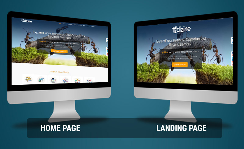
The main difference between a home page and a landing page is that we should aim to optimize the landing page toward pushing the visitor into performing a certain action. Whereas, homepages could be made to push customers into more than one action and present more information about our product. On the other hand, it is less detailed at the same time.
Landing pages present detailed information for a certain aspect of our business or a product and urge visitors to purchase or register, and not both.
All online campaigns should lead to a landing page if their goals are conversions. When your goal is brand image and awareness, then you can use your homepage, instead.
Now that we know the main differences between the two, let’s dive further into what needs to be done to optimize a landing page.
#1 Use Analytics

Since landing pages are all about conversions, you should definitely set up your conversion events and conversion goals in Google Analytics right away.
Trying to optimize a page without actually running analytics is like shooting in the dark. Simply don’t do it.
The key to optimizing a landing page is knowing at what part of the conversion funnel your visitors are opting out, figuring out why, and fixing the issue right away via the help of A/B testing. Once you have a clear picture of your steps, you can easily determine what the missing link is.
#2 Is your value proposition crystal clear and compelling?
Drafting a compelling value proposition that everyone gets should be a top priority for every business. Not only will it help you resonate with your audience better, but it will also instantaneously answer the question “What does this company offer” right away.
Aside from that, it should also aim to answer a couple of questions more, like “Why is this product better than the competitor ones?”, and “Why is this product worth the money?”, as well as “Who is this product aimed at?”.
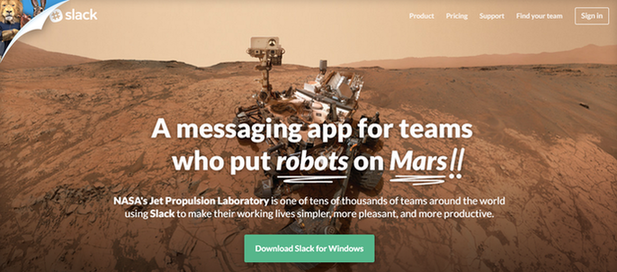
As seen in the image above, Slack doesn’t only clearly state what their company is doing “messaging app”, but they also use testimonials and social proof in the value proposition on their home page.
And while home pages should differ from landing ones, people who directly land on a landing page should also get a notion of your company’s value proposition in general.
To sum up, a value proposition should include:
- The purpose of your product or service
- The target audience of your product or service
- What makes your company unique and preferable over your competitors
- Demonstrates, shows or describes the end-benefit from purchasing your product
The tricky part is doing all of this in one or two sentences, a heading, and some images. If you manage to answer the majority of questions that would arise in a visitor’s mind just from a glance at your website, you are more likely to keep them.
#3 Does the landing page match the advertisement that leads to it?
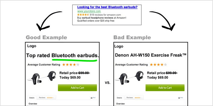
Matching problems often result in low conversions, a high bounce rate, or both. Some platforms like Facebook even prohibit the use of mismatch between the landing page and the advertisement.
Possible mismatch cases that might greatly dissuade your visitors could be:
- A wrongly advertised price
- Different heading, keyword or image
- Wrongly advertised product or service
- Lifted expectations
- Very different design
If the images on the landing page greatly differ from the ones that are shown in the ads leading to the landing page, the user might think they are at the wrong place.
Moreover, instead of creating just one landing page, and using multiple campaigns to funnel different traffic into it, create more than one, highly tailored landing page.
If you are selling a product that can be sold to more than one audience, for example, a powerful laptop, that could both be used by gamers and architects, create two separate landing pages.
One – emphasizing the benefits the laptop offers to a gamer.
The other – emphasizing the benefits it offers to an architect or engineer for technical work.
Moreover, make sure to correctly direct traffic and not mingle it from one source into the other. Tailored landing page experience can increase conversion rates to almost double in some cases.
#4 Test and evaluate first impression reactions
In order to make a better first impression than your competitors in the given business segment, you need to know what they are doing. Moreover, if you don’t you mind end up replicating one of their concepts without knowing it.
Thus, it is a good idea to simply google a keyword you are ranking and fighting for and browse through the websites of your competitors. Don’t panic! We’re not doing this to copy them, simply write down in a list what the first impressions they are giving are.
Intuitive designs play a vital role here. Studies show that our brains perceive landing pages much quicker than half a second. This would mean, that as soon as the page loads if there is something vague or confusing, we are more likely to close the page or perceive it as something that wouldn’t work for us.
Make things familiar and easy to navigate.
#5 How to properly use images in landing pages
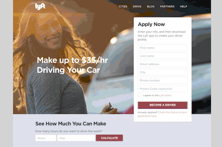
Images can greatly reinforce the message you are trying to convey to your visitors. Is your target audience in the picture? If not, why not? If you are targetting young mothers, then why aren’t children or young mothers with children in the picture?
Images can greatly reinforce the emotion that you are trying to instil in your visitors. If your target audience mainly consists of young professionals, then include such photos as a background to your product page, home page or landing.
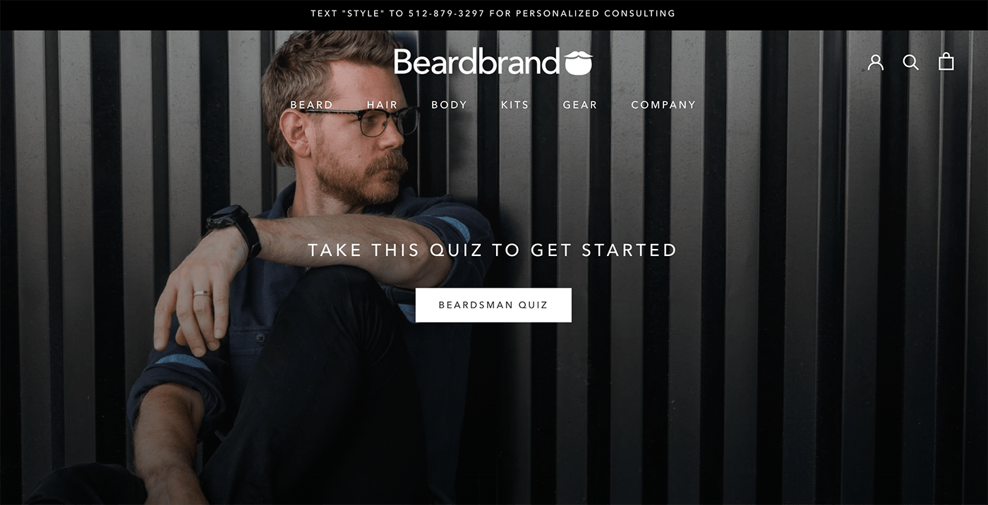
Of course, if you are offering a beard grooming product you are going to put a guy with a great beard or moustache your audience is going to resonate with.
Images are not only used to inspire emotions in visitors. They can also be used to explain the functionality of a product, or at least how it looks like.
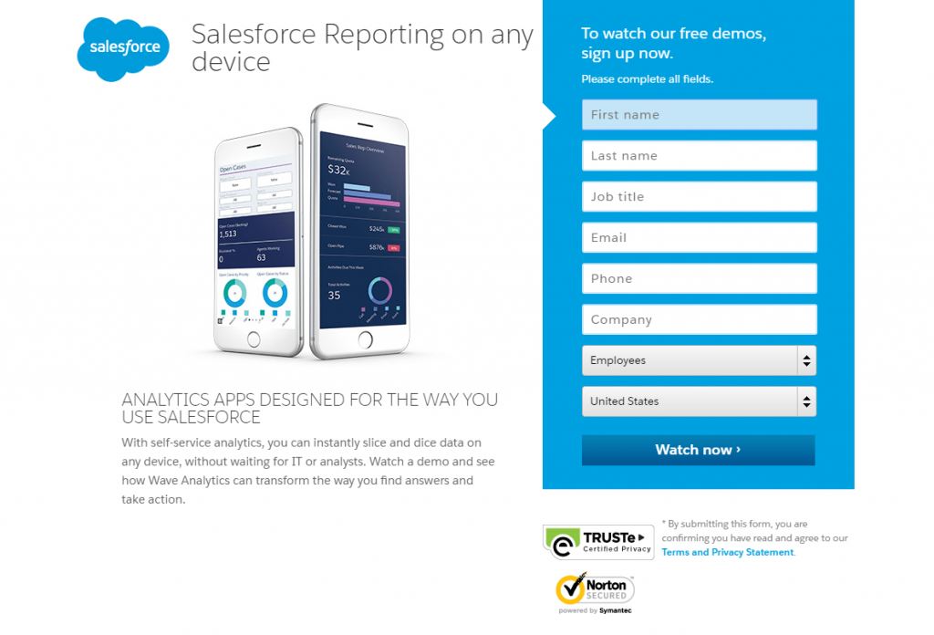
Salesforce uses its landing page image not to inspire emotions, but to further show what their service actually is. Moreover, they show you that the analytics can be seen on any device whatsoever. For more technical or business-oriented products, emotions are usually stripped and technical language steps in to further increase the conversion chances of your leads.
Of course, you could use happy business faces as an image here, but what does that really say about your product? That it is going to make your employees happy? We’re not here for that, we want to make them productive. There are other services that aim to increase the happiness of employees, and SalesForce isn’t one of them. Thus, they keep things technical.
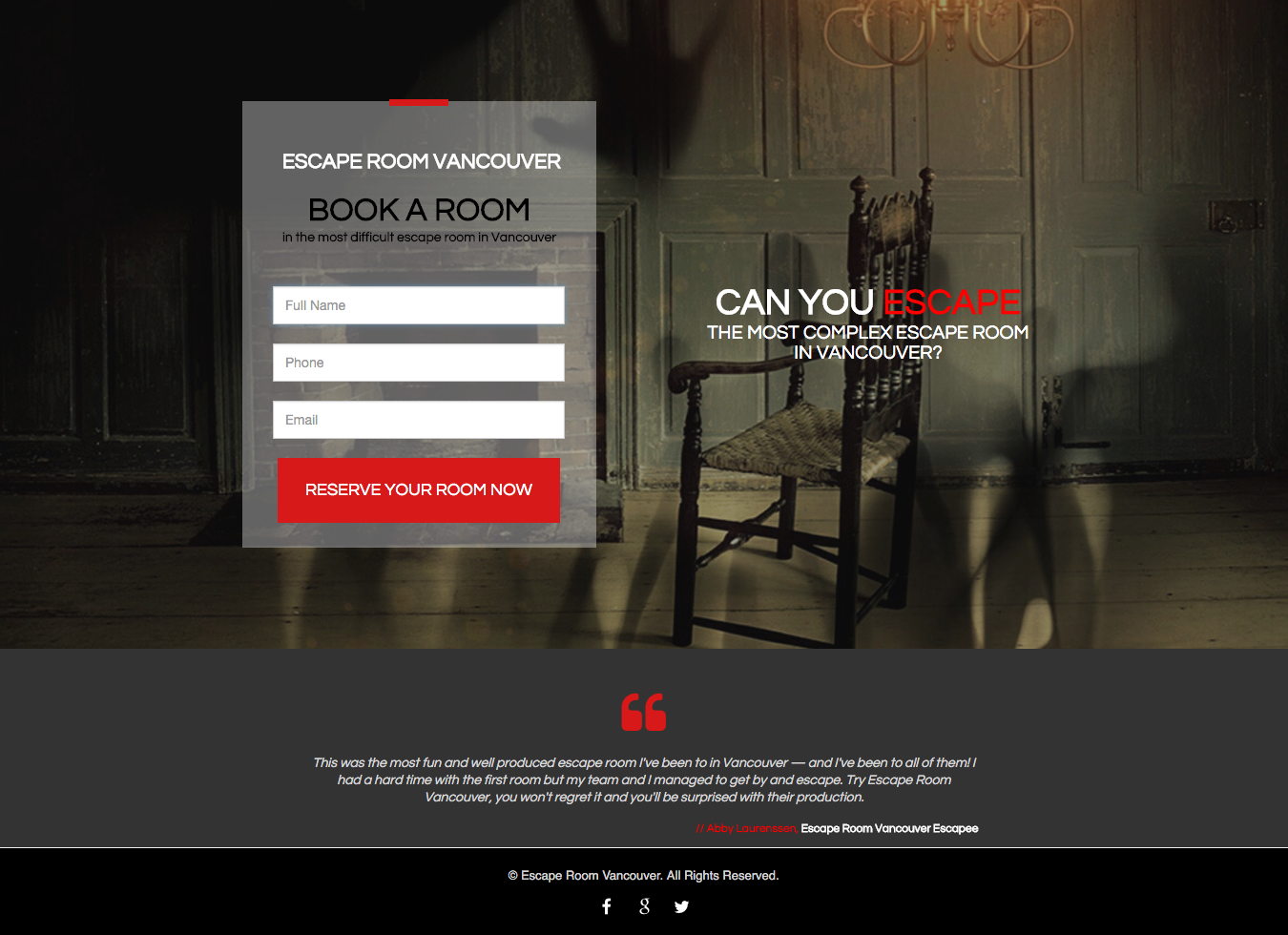
#6 What emotions does your page provoke?
Are you advertising an escape room? If so, you could try to instil fear in your visitors. Not only fear but a sense of adventure or a mystery can be used to further hook them and capitalize on their curiosity.
Others might rely on challenging their visitors. It is practically the same technique but used in a different way.
Research what your audience seeks and challenge them if your product or service allows it. If you are offering a service that allows people to boost their income, ask them – “Could you make $1000 in a 10-hour workweek? With [insert product name], you can” Just an example, of course, the details would be different for each product or service.
There are many emotions and character traits that you can exploit and use to your advantage, such as:
- Fear
- Joy
- Humour
- Love, Peace, Charity, Compassion
- Sorrow
- Shock, horror
- Generosity
Most businesses are oriented toward serving either one type of customer or practically whoever comes through the door. If you specifically know what your target audience is, that would make things much easier. Are you targeting gamers? What do they want to do? Win games. Then make them feel like champions when they land on your page, simple as that.
These feelings can be driven through images, messages, overall design or colours on your page. But this doesn’t necessarily mean that each and every single element on your page will provoke feelings on its own. Green doesn’t always provoke calm feelings and peacefulness in our visitors. Nor does black stand for sorrow and darkness.
The overall design of your landing should consist of matching elements in order to convey the right message and emotions. Saying a joke, while your webpage looks aggressive and threatening might confuse your audience.
#7 Social proof
Especially when your product is novel and people have never heard of your brand before, you need social proof in order to back your claims.
Social proof can come in many forms and ways, such as:
- Testimonials
- Certificates, awards, nominations
- Press, articles, print from reliable sources
- Social media mentions by influencers
- Sales count
- TV/Radio/outdoor advertising

In some cases, as seen above in the image, social proof is used in advertising, along with home pages and landing pages. If you are a SaaS business, which aims to improve the productivity of companies, and you already have a big, renowned company as a partner or client, make sure to mention them somewhere on your page. And make it visible.
You would be surprised, how many people would trust you more, when they know that you are a partner of Coca-Cola, Microsoft, Twitch, or whatever reputable company has placed their trust in you. Even if your partners are not so well known, you can still list some of them on your webpage, along with testimonials from people.
#8 Focus group test your copywriting
Does your copy follow the AIDA framework or any other copywriting model? If not, make sure to conduct some research and find out about how you can greatly influence your visitors with the right words at the right time.
If you haven’t followed any guidelines, but you still think your copy is good enough, challenge it to make sure. Create a small group of 3 to 5 people, regardless of their expertise, and present them with your website. Let them evaluate the subheadings, headings, and imagery. Let them score from 1 to 10 on each separate piece of copy in different categories.
Ask them simple questions like:
- Does that heading make you want to “read more”?
- Do you want to register on the website at this point in the journey?
- Does this make you feel excited?
- Do you want to click on this CTA?
- Is the product’s purpose clear?
- Do you get who the product is for from the text?
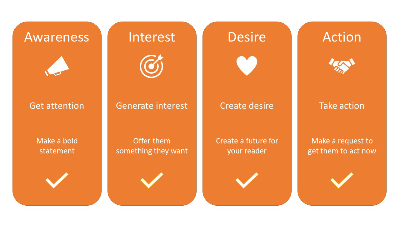
Awareness is usually created by spreading advertisements in smart places, using provocative imagery or cunning headlines. Once you’ve captured an audience’s attention, you want to generate interest. You can do that in a wide variety of ways.
Most big brands aim to create both awareness and interest at the same time by using reputable figures such as football stars, actors or influencers to advertise their products.
Once, you’ve captured the attention and interest of the user, they can become a visitor on your website. Now you need to share some features of your product or service, and persuade them to purchase. You can do that by the use of:
- Bullet points of key benefits
- Results examples
- Imagery
- Before and after comparisons
- Testimonials
Show the prospect how your product is going to change their life for the better, and they will purchase.
#9 Are your CTAs the right ones?
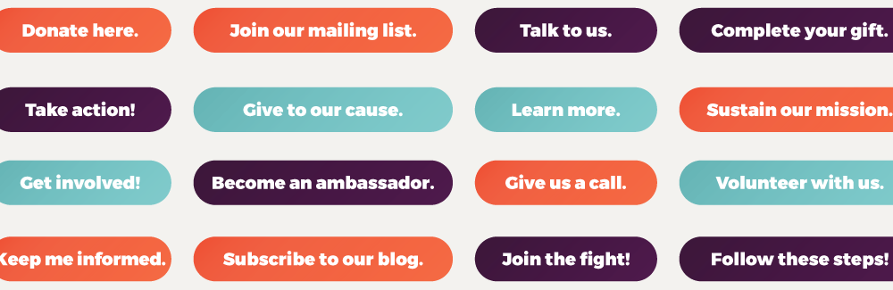
While you’re at it with the focus group you’ve formed, make sure to also perform a test on how well they respond to the CTAs. Of course, you should also conduct A/B testing for real statistically significant results, but having live feedback from your audience is also as important.
You would be surprised how often subscribe would work much better than enrol now or purchase for some services, as it sounds less threatening.
The Call to action should be considered as a door where your client decides to enter your store or not.
There is a very wide variety of words you can use. If your product or service allows it, you can use humour, or challenge in order to further entice your audience to join you. If your product is an online browser video game, simply using “Register here” is boring. “Join the fight”. “Create your hero” or something of the sort is an entirely different story.
#10 A/B Test every page element you think could improve
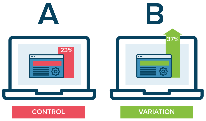
In order to properly start A/B testing your landing pages, you should create a document or write down a note on a sheet, dividing your landing pages. Afterwards, separate all the elements that you wish to test under the pages.
Then, come up with alternative versions, the so-called “Variations” in A/B testing. Test one thing at a time, don’t go over your head and try to test everything at once, this will mess up your results. Once you get statistically significant results, make a decision whether you should use the variation or you keep the control until you find a better option.
You can also create two pages, competing for the same keyword and conversion and test which one yields better results.
Conclusion
All in all, a visitor often makes their decision even before visiting your webpage. Regardless, you should always aim to improve the conversion rate of your pages. Always make sure to emphasize why your product is better, how it can fix a certain problem and show prospects how your product would potentially improve their lives.
Sometimes showing is better than telling. Use images, colours and design to the fullest, and make sure a part of your value proposition is visible not only on your home page but also on your landing pages. Track all changes and potential ideas with A/B Testing and decide with the help of data.
More from our blog
All you need to know about Multivariate Testing