What is Call to Action and How to Use it to Increase Conversions
A CTA or a Call to Action is a marketing term that refers to encouraging your visitors or potential customers to take action right away. For example, most often, it can be a verb in an imperative form like “Buy now”, “Make a Purchase”, “Sign Up” or “Register”. CTAs are mostly used in marketing and […]

A CTA or a Call to Action is a marketing term that refers to encouraging your visitors or potential customers to take action right away. For example, most often, it can be a verb in an imperative form like “Buy now”, “Make a Purchase”, “Sign Up” or “Register”.
CTAs are mostly used in marketing and digital marketing campaigns to nudge visitors toward performing a certain conversion.
Do you know how to properly optimise CTAs and where they are most effective? Let’s find out.
Call to action, In-depth explanation

As mentioned above, we can call any text or phrase that urges people toward a specific action a CTA or a call to action. Typically, most websites or platforms use buttons with text. Adding an item to a shop cart is the perfect example of a well-known call to action. In the majority of cases, an action verb is used to entice the visitor.
Moreover, it isn’t simply a verb like “To purchase” or “to buy”, it is usually paired with a word implying urgency like “now”. So “buy now” hints to the user that the offer wouldn’t be available forever and they have to act immediately to grab the opportunity.
Similar combinations of words are tested and used to determine which one works best for the business. CTA or action buttons have a few aspects that you can undergo changes and be tested. Some of these are:
- Word copy (Text)
- The action word used
- Form
- Placement
- Colour
- Size
- Visual aspect
What can reflect on your decisions here is mainly how your target audience reacts. If you have proper data on what is the age of your target audience, what is their gender, preferences, nationality or addresses, you can better tailor their experience and even use local slang if needed.
What makes a CTA efficient?
Every purchase funnel needs brilliant CTAs. Each step of the way in any sales funnel includes more than one call to action. All of them should feel intuitive and non-intrusive, yet enticing. Generally speaking, CTAs need to be intuitive and very obvious.
Be clear about what is going to happen when they click it. “Purchase” means finish the purchase, while “Proceed to checkout” means they are not yet fully committing to the purchase and can still revise some of the steps before checking out. This can sometimes make all the difference in the world since visitors unwilling to commit at the time would otherwise bounce off.
Types of Calls to action
A call to action can urge the client to register, sign-up, purchase, becFome a patron, or even try a product’s free trial. Depending on the product or service you are offering, practically the sky is the limit. The most commonly used CTA is the direct call to action.
Direct Approach
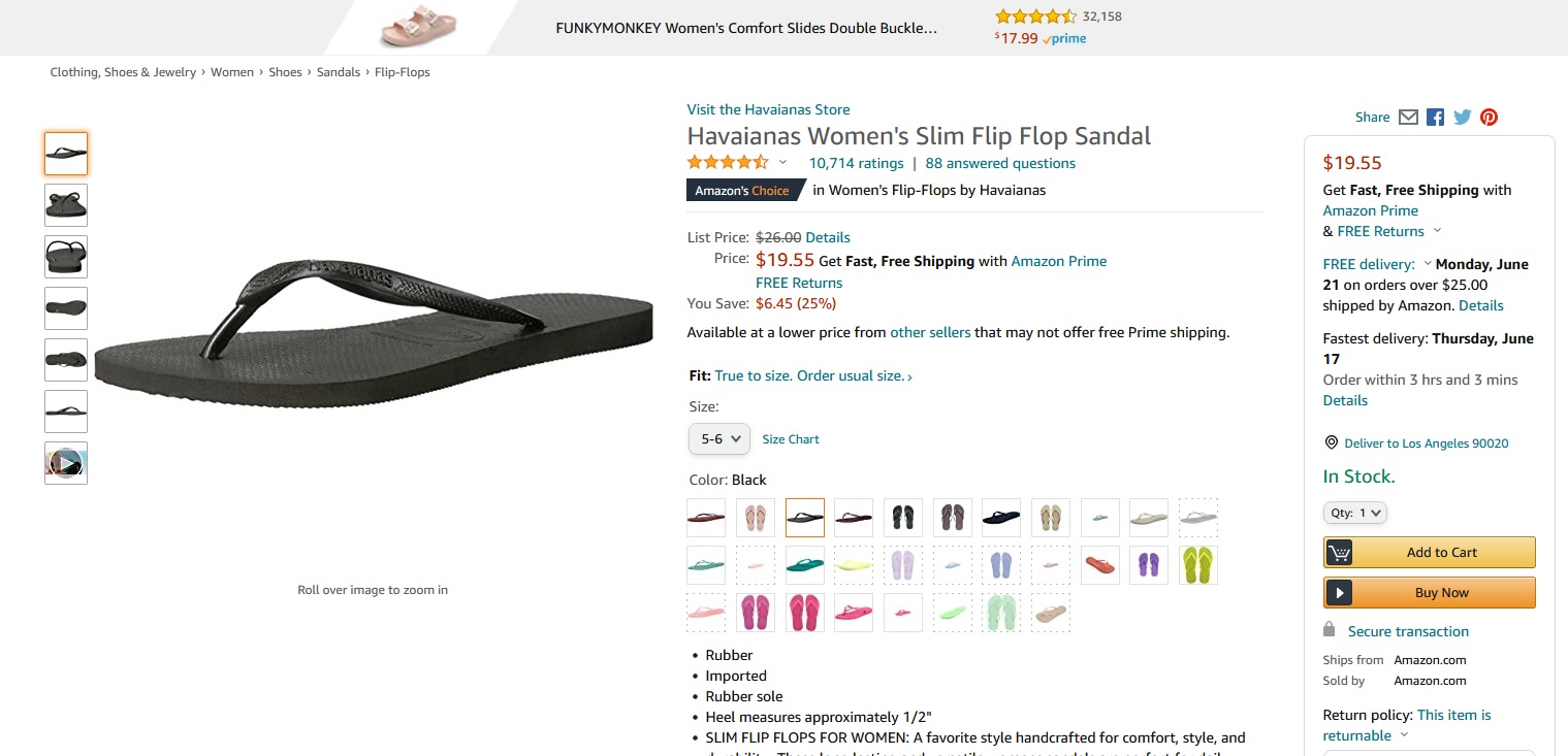
The direct approach consists of eliminating most steps along the way and urge the customer to finish the purchase immediately. This mainly works for large e-commerce websites that are already trusted and have a good reputation.
While Amazon urges you to purchase the product immediately, they also give you the choice to add to the cart and proceed shopping for other products at the same time, without disrupting your process. This is a good approach, especially if your shop offers a wide variety of goods.
Register CTAs
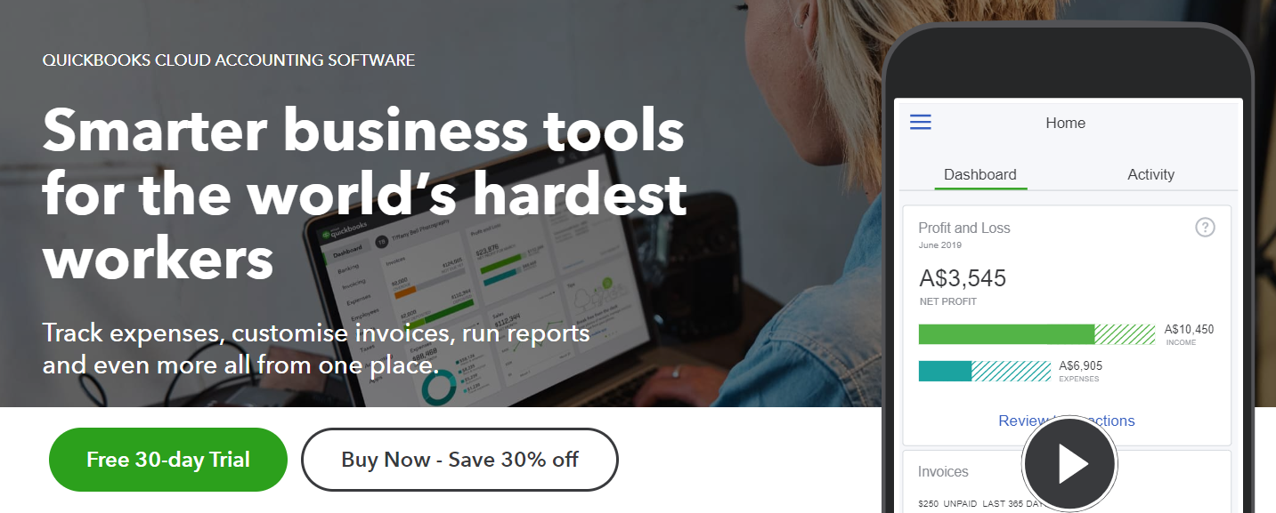
When your service requires the visitor to register, you have to carefully think of how you would want to devise the process. Would you first give them a small demo free of charge, or would you require them to register so that they can experience the demo?
It is entirely up to you since different approaches work for different services. A good example here is the CTA of Quickbooks. The primary CTA is a free 30-day trial which implies you are about to register. The secondary is a direct one “Buy Now – Save 30% off”. The secondary one kind of implies urgency, that it is a one-time deal.
What seals the deal here is the sentence below the header, explaining what exactly the accounting software does.
You can use similar wording for register CTAs:
- Start free trial
- Sign Up
- Join Us
- Register
- Create an account
Simplistic CTAs

Simplistic calls to action are most often used in social media promoted posts and ads and typically consist of a few short words that make you “Read more”. The most commonly used words and phrases here are:
- Find out more
- Read more about
- Learn more
- Check it out
- Start here
These work when you give the visitor or lead some information for free, and lure them in by offering more information to be given away after they make the click and commit to visiting your website.
Email Subscription CTAs
Whether someone has registered on your website, uses your services, or has purchased the products you are offering, you will most likely have the email contacts of these people. Use them to your advantage, and try to generate leads who haven’t yet converted.
Typically, you can use a discount one-time voucher, offer, or coupon in order to entice them to act. The most commonly used buttons and text copies here are:
- Get free coupon
- Get free discount
- Subscribe now
- Sign up for our newsletter
Calls to Action Examples
1. “Build My Resume” CTA by My Perfect Resume
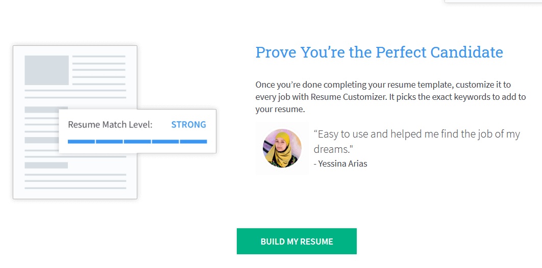
My Perfect Resume’s team is well aware of how smart applicants for important job positions need to tailor their resumes to specific job offerings to increase the likelihood of getting interviewed. The CTA in this case is fairly simple, it’s simply “Build my resume”, but implies that the system would do it for you or at least guide you through a very complex process, making it simpler.
Graphical elements come into play here, showing you that there are many templates available to choose from. Moreover, you won’t need to judge things yourself, the system would guide you toward making the right choices.
In combination with the call to action that we can see above, when visiting the website you are also exposed to other information like:
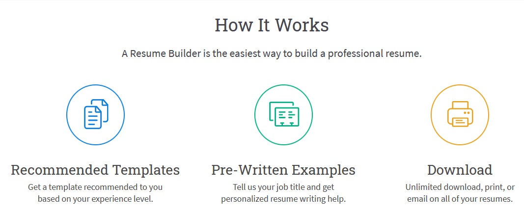
By the combined usage of graphics, steps and explanatory copy, myperfectresume’s team shows the visitor how simple things really are. Not only that, the entire process is tailored to the visitor’s specific experience and needs.
2. Shopify
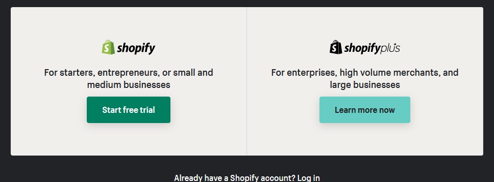
Shopify divides its landing into two CTAs because Shopify’s marketing team has split their services in two to serve different types of clients. It specifically states which call to action should you use if you are an entrepreneur, small or medium business and which one should you click if you are a high volume merchant.
As simple as it looks, this design is far from inconsiderate. The package for large businesses is devout of colour, making it look more professional and rigid. Aside from that, the buttons have contrasting text colours to differentiate themselves from each other.
Some people might have an objection to starting a free trial. The most common objection that visitors have when signing up is giving away their credit or debit card details. This is why Shopify doesn’t require such and states that in the next step.
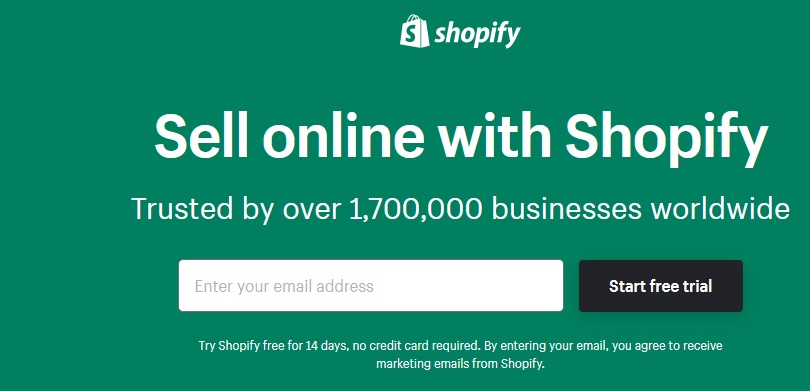
Use empty space under forms or action buttons to fill in with text that battles the objections of your potential clients. In this case, Shopify smartly states that they require no credit card. In some cases, this can drastically increase conversion rates.
3. Udemy’s “Invest in you, today”

Udemy decided on utilizing a search bar instead of a call to action button, since they offer pretty much any course you can think of. In their case, this works because they don’t offer a single product. Along with the webpage, there are numerous other secondary calls to action. Aside from these, you get nudge notifications and ending sales prompts to further entice the visitor to sign up as soon as possible.

Every user that visits udemy.com who is unregistered sees this message that does two things – gives them a discounted price and a deadline. (Creating scarcity). If you carefully think about Udemy’s business model, you would come to the conclusion that the majority of the courses offered on Udemy are not produced by their team. Other people create them. Third parties teach on Udemy. Thus, there should be a separate call to action for these people. And, of course, they are the primary source of content, but not the primary source of income, and for that reason, they come second after the customers.

If you zoom the image above you would clearly see the “Teach on Udemy” CTA, which is located in the upper right corner of the image above. So what is the key take-away from the last two examples?
Both Udemy and Shopify:
- Separate their audiences
- Create distinctive CTAs for different audiences
- Place them accordingly (Shopify places the more important option on the left, and Udemy places the preferred CTA in a more visible place)
- Both businesses have primary and secondary CTAs
4. Inika Organic’s CTA quiz

Not only does this tell you that Inka Organic really cares about tailoring their product to your interests, and giving you the best treatment possible, but also it sends the customer down the shopping funnel and there is no going back.
The quiz serves the function to gather enough information for the potential lead so that product recommendations feel natural to them afterwards via email or account notifications.
Let your customers know that you are not simply shoving products into their shopping carts. Show them that you care and they would willingly share information that would improve your CRO.
5. AncestryDNA’s “Save Now”
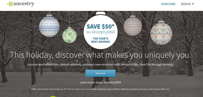
It is doubtful that anyone considers checking their ancestry a necessity, but it’s something most people wouldn’t refuse if it were a free service. Following this logic, if anyone was ever interested in running an ancestry DNA check, a smart remarketing campaign would lead them to the landing page which offers a juicy discount.
“Save Now” implies that you were going to purchase this anyway, so why not go ahead and save $50 while you are at it. Sometimes there’s a very small detail that you’ve missed to mention that dissuades the customer from purchasing. Such can be “No initial costs”, or “No credit card required”. And as you can clearly see in the image above, below the CTA button there is a line of text stating that the offer is only valid if used before a certain date, thus creating urgency and scarcity.
Improve your CTAs with A/B testing
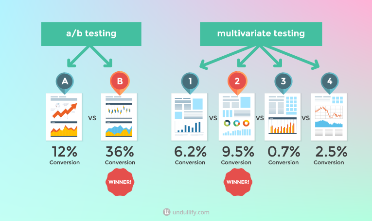
If you already have a control option that you have been sticking to for the past couple of months, that’s okay. Use it as a basis for improvement and test out various options via A/B testing or multivariate testing.
A/B testing is a technique used for conversion rate optimisation, among other things like design, user experience, and even SEO. It is a simple concept which entails you creating a second option called variant and you run the two options together. Whichever gets the better results wins. (If there is a statistically significant difference between the two.)
A/B testing can be used to improve the UX of your website, and the CRO of your CTA buttons simultaneously. Here’s a quick guide on how to A/B test your CTA buttons.
How to A/B Test CTAs
The first thing you need when setting up an A/B test is a goal.
#1 Determine your goal and the KPIs you would strive to improve.
Simply changing the shape of a CTA button wouldn’t yield amazing results in most cases. In order to change something in the design of your website, you need to have a hypothesis in mind. For example, if the goal of your test is to increase the number of people who go to step 2 of your checkout process, think about what might scare people away in the first place and battle their objections.
#2 Define your Control (original version) and the variation (new, tested version)
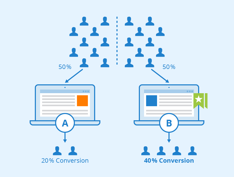
If the current text on your CTA button is “Purchase now”, this will be your control. Let’s say your hypothesis is based on the fact that the users in your target audience are young and like things to be less serious. If your product is a Rock’n’Roll course, you can use an action button like “Let’s Roll” or “Rock’n’Roll”. This would be your variation.
#3 Let the A/B test run
The good thing about running tests is you can determine what portion of your traffic can land on the new variation. Usually, you would want to split the traffic 50/50 if you are testing control and a variation.
#4 Gather the data
Allow for a month to pass and make sure that the results you get have a bigger difference than 0.5 per cent. If the conversion rates of both options you tested end up being 10 per cent and 10.1 per cent, implementing a change wouldn’t be groundbreaking.
#5 Change things up
If your hypothesis gets confirmed, and the new version beats your control version, then change things. If not, either try something else, based on another hypothesis or keep things as they are.
Conclusion
CTAs are an important part of your website’s landing, homepage, or even advertising campaigns. A/B testing can come in handy when thinking about changing things around your website, especially CTAs. Create urgency and nudge the customer towards making the right choice.
Call to action buttons should be intuitive and should appear where a visitor would naturally search for them. Now that you’ve seen some of the most efficient CTAs out there, it’s time to optimise your own.

